04 Codes and Conventions Website
- Light purple colour scheme and by using grey instead of black it doesn't appear harsh.
- Merchandise is advertised straight away on the website.
- Hyperlinks are along the left.
- Here name is clear and unforgettable on the website.
- The opening page advertises most recent album and 2 hyperlinks are at the bottom, the page is intended to be scrolled downwards.
- Here name is again central but to see pictures of her, you have to scroll. She is very famous so doesn't need her face front and central.
- Small piece of writing to the audience from the artist.
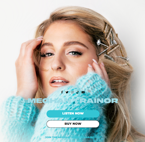
- Blue and white colour scheme again not too harsh. The colours coordinate with her jumper making the website appear cohesive.
- Close up to immediately connect with audience, she is staring straight at the camera and it is close up making it appear personal.
- Merch is advertised further down.
- Black and red colour scheme appears powerful, going well with Avril's more punk vibe, I'd probably stick with a lighter colour scheme to appear more palatable.
- Album directly advertised and the picture is cool and punk, merch advertised below.
- Black, white and gold and a mermaid Brittney unchained, goes along with the end of her censorship thing from her dad. Freedom
- Hyperlinks to the left with social medias linked at the bottom, no merch or music being advertised. Cohesive color scheme.
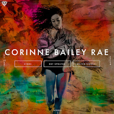
- Here name is central and the colors are bright and eye catching, she takes up the whole opening screen then you scroll down for tour dates in a rich purple.
- Hyperlinks again to the top right, its clear the website is dedicated to her.


No comments:
Post a Comment