Joanna Attwell Media Studies Blog
Thursday, June 9, 2022
WEBSITE
Tuesday, May 3, 2022
PRODUCTION
Production
I could not upload my music video onto the blog due to copyright issues, but it can be found on the media page of my website in the video section.
Friday, April 22, 2022
08 PLANNING WEBSITE
08 Planning Website
First mock up of website. 14/07/2022
07 PLANNING PRODUCTION
07 Planning Production
This is a power point with my initial ideas for my music video and first story boards.
Thursday, March 24, 2022
06 AUDIENCE RESEARCH WEBSITE
24/03/2022 Formed focus group
5 x Female (Ages 16, 17, 18, 22, 25) 3 x Male (Ages 17, 19, 23)
All members of the focus group identify as viewers of anthemic artists websites. They would also consider themselves aspirational and have agreed to keep in contact through email and teams meetings to respond to questions.
15/07/2022 First draft feedback
I made my first mock up of the website and showed it to my focus group. I asked them several questions about what changes could be made and what could be improved.
1. What did you like about the website?
2. What did you not like about the website?
3. What do you think could be done to improve the website?
The general consensus was that the song, artist and website did not line up. One person (female, 18) said 'the pastel colour scheme is too soft and doesn't match the heavy beat throughout the song and party girl image of the artist'. Another person (male, 23) said 'a brighter colour scheme may work better'.
Despite these criticisms, the majority of the group liked the name bethANY and one member (female,22) said 'the play of words in the name is unique and it is the sort of thing that will stick in my head'.
The layout as a whole was liked, one member (female, 16) said 'the website is easy to navigate and by having images of the artist on the welcome page, I was able to make a connection between the name and face'.
As a result of this meeting, I intend to change the colour scheme by using a neutral background but bright images of the artist herself, to make her stand out. I will take further inspiration from Kesha's official website where she uses an ashy background and rainbow images of herself, this will help my artist to stand out further.
05 AUDEINCE RESEARCH PRODUCTION
24/03/2022 Formed focus group
5 x Female (Ages 16, 17, 18, 22, 25) 3 x Male (Ages 17, 19, 23)
All members of the focus group identify as viewers of anthemic music videos, most predominantly female pop anthems. They would also consider themselves aspirational and have agreed to keep in contact through email and teams meetings to respond to questions.
21/04/2022
I met with the focus group to ask some questions to help me with my music video research.
1. What is your favourite era of female anthemic pop songs?
3 females (16, 18, 25) and 2 males (17, 23) identified that they enjoyed 2000s and 2010 female pop anthems.
1 female (22) and 1 male (19) said they most enjoyed 80s female pop anthems.
1 female (17) identified the 90s as her favourite era of female pop anthems.
I then asked the largest group (80s) their favourite female anthems from that era. They answered with a range of songs by Madonna, Pat Benatar, Cyndi Lauper and Dolly Parton.
2. What is your favourite era of anthemic music videos?
4 females (16, 17, 22, 25) and 2 males (19, 23) identified the 2000s and 2010s as their favourite era of anthemic music videos.
1 female (18) and 1 male (17) identified 80s anthemic music videos as their favourite.
This meeting helped me to decide to choose an 80s song and film a music video using inspiration from the 2000s and 2010s.
Friday, March 11, 2022
04 C AND C WEBSITE
04 Codes and Conventions Website
- Light purple colour scheme and by using grey instead of black it doesn't appear harsh.
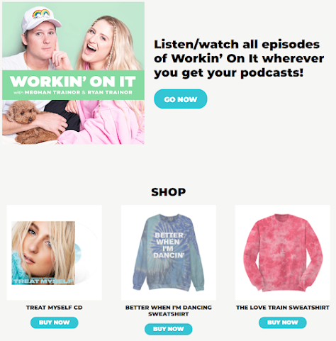
- Merchandise is advertised straight away on the website.
- Hyperlinks are along the left.
- Here name is clear and unforgettable on the website.
- The opening page advertises most recent album and 2 hyperlinks are at the bottom, the page is intended to be scrolled downwards.
- Here name is again central but to see pictures of her, you have to scroll. She is very famous so doesn't need her face front and central.
- Small piece of writing to the audience from the artist.
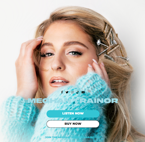
- Blue and white colour scheme again not too harsh. The colours coordinate with her jumper making the website appear cohesive.
- Close up to immediately connect with audience, she is staring straight at the camera and it is close up making it appear personal.
- Merch is advertised further down.
- Black and red colour scheme appears powerful, going well with Avril's more punk vibe, I'd probably stick with a lighter colour scheme to appear more palatable.
- Album directly advertised and the picture is cool and punk, merch advertised below.
- Black, white and gold and a mermaid Brittney unchained, goes along with the end of her censorship thing from her dad. Freedom
- Hyperlinks to the left with social medias linked at the bottom, no merch or music being advertised. Cohesive color scheme.
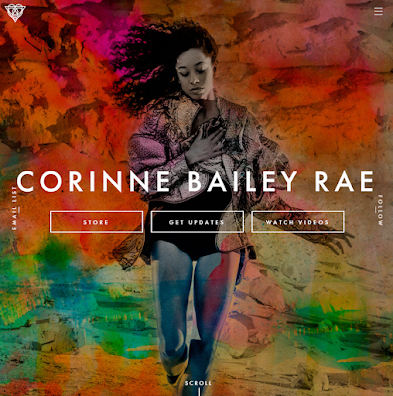
- Here name is central and the colors are bright and eye catching, she takes up the whole opening screen then you scroll down for tour dates in a rich purple.
- Hyperlinks again to the top right, its clear the website is dedicated to her.
WEBSITE
Home | bethANY (joannasarahattwell.wixsite.com) My first page is my home page which includes an automatic sliding gallery, audio player for ...

-
Home | bethANY (joannasarahattwell.wixsite.com) My first page is my home page which includes an automatic sliding gallery, audio player for ...
-
Practice Task 01: Researching Codes and Conventions of Music Videos Examples of Pop Punk Music Videos Codes and Conventions of Pop Punk Mu...
-
02 Statement of Intent Tik Tok- bethANY How do you intend to use the four areas of the media theoretical framework to communicate meaning a...


